Festival Visual Identity and Promotional Materials
The festival’s visual identity was created for the Mieczysław Wajnberg Institute in collaboration with the Podlaskie Museum in Białystok. The festival introduces audiences to Jewish music — from classical compositions to Hasidic and shtetl music.
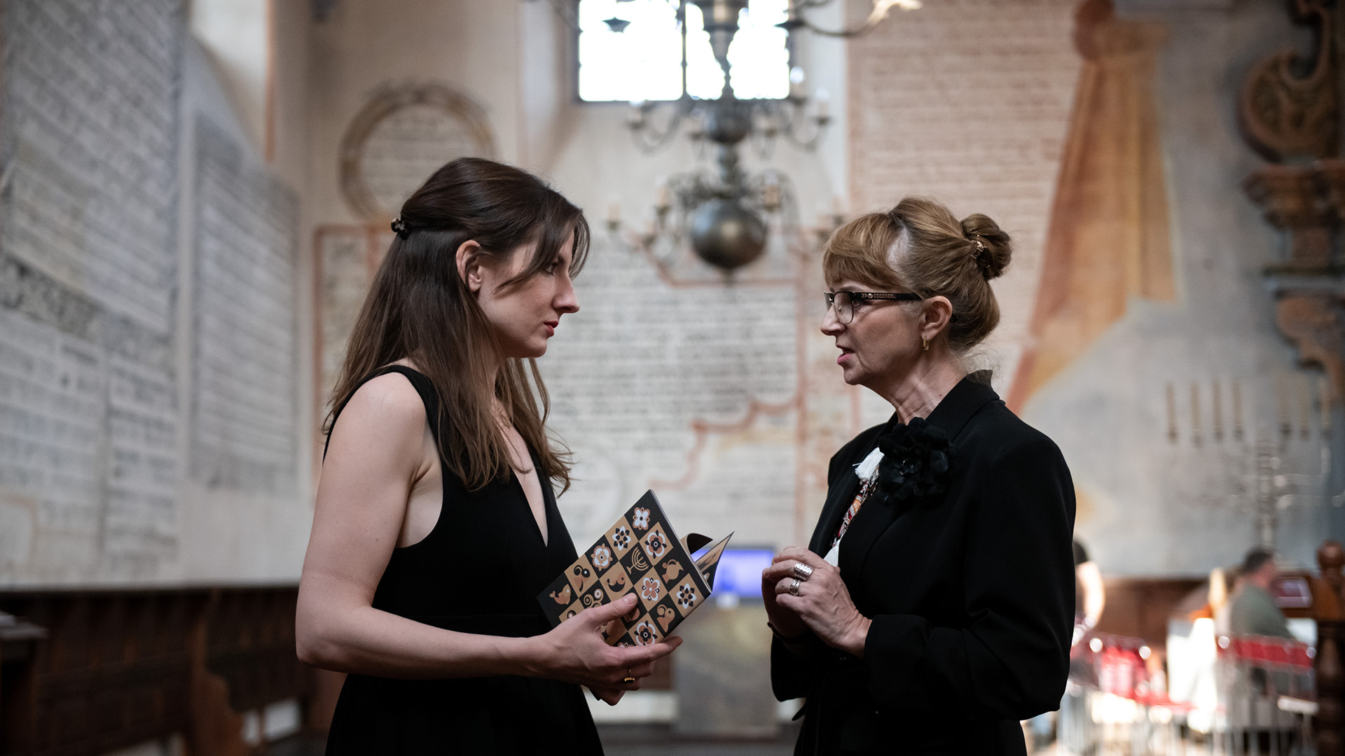
Since 2024, a new visual identity has been developed for each edition of the festival, including a poster, event catalogue, banners, and social media graphics, while maintaining consistency with the Festival’s logo. Below, we present three editions created between 2024 and 2026.
Scope of work: Poster Design | Event Catalogue | Banners | Social Media Graphics
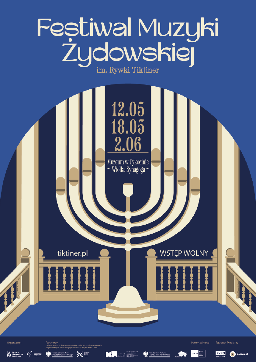
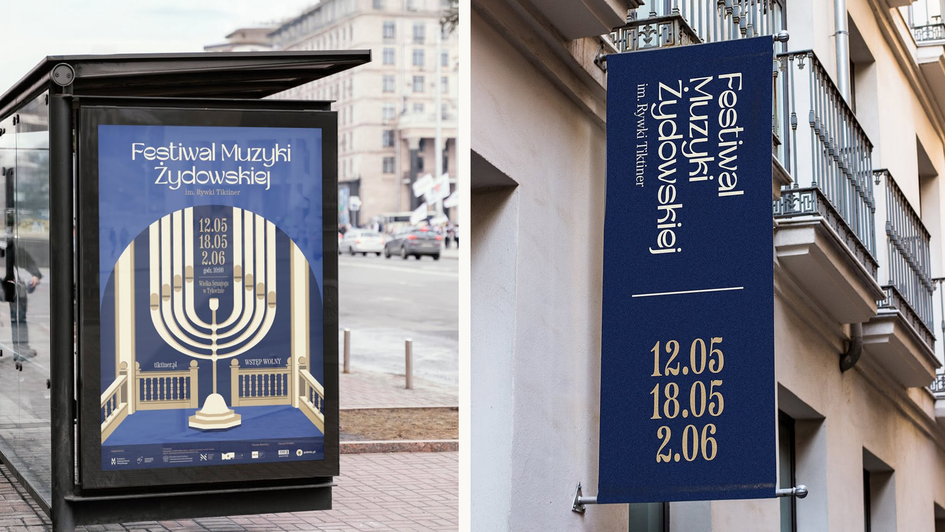
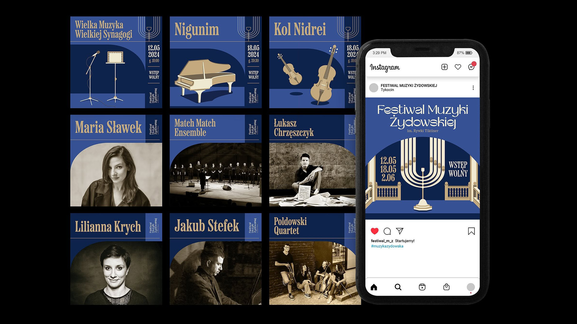
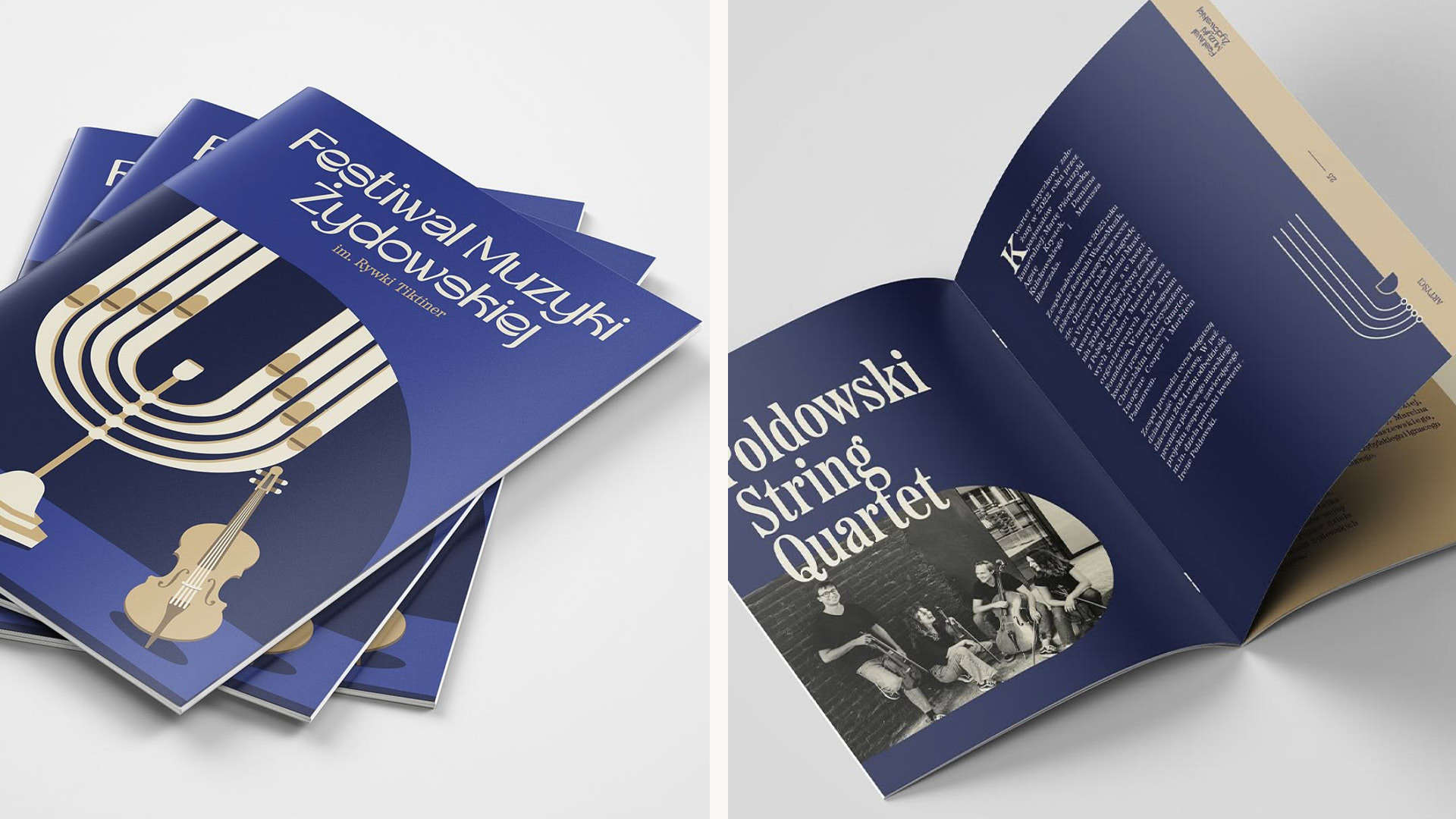
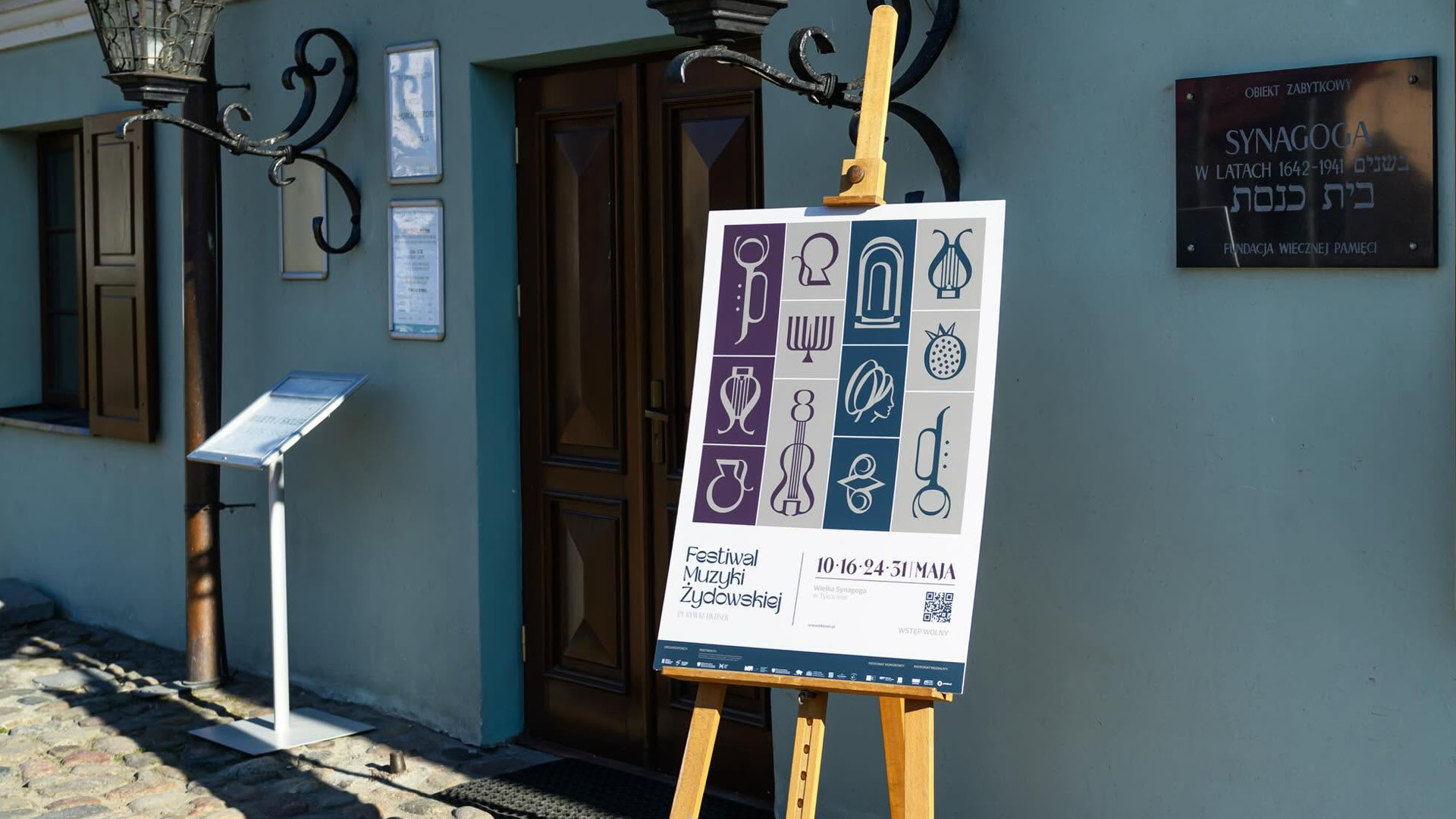
The visual identity for the 2024 edition is based on the motif of the menorah combined with the architecture of the Great Synagogue in Tykocin. The geometric illustration creates a direct reference to the location and the cultural context of the event.
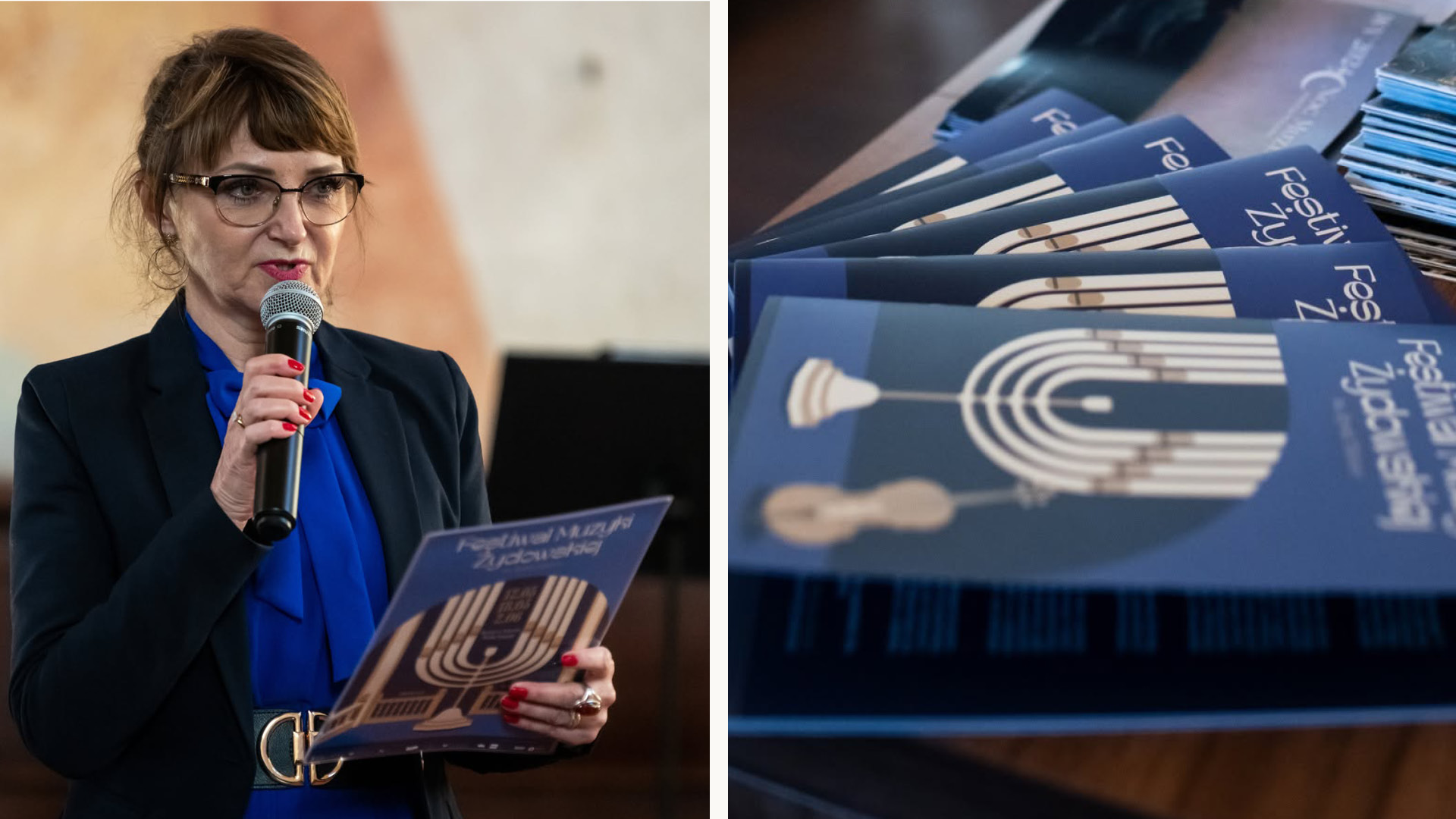
Deep navy and shades of blue, combined with warm off-white tones, give the design an elegant, classic character. The visual system was applied across posters, the festival programme, and social media materials, combining illustration, artist photography, and distinctive typography into a cohesive identity.
2025
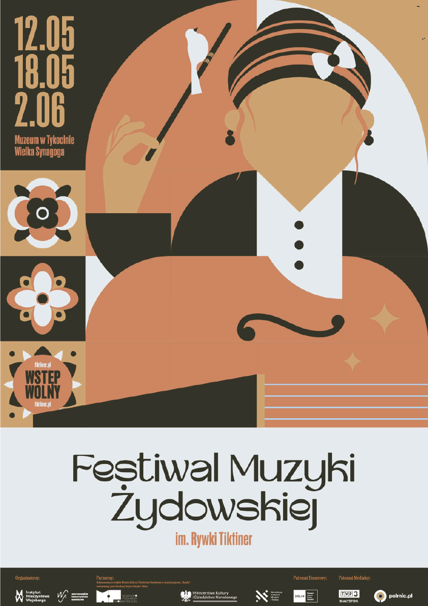
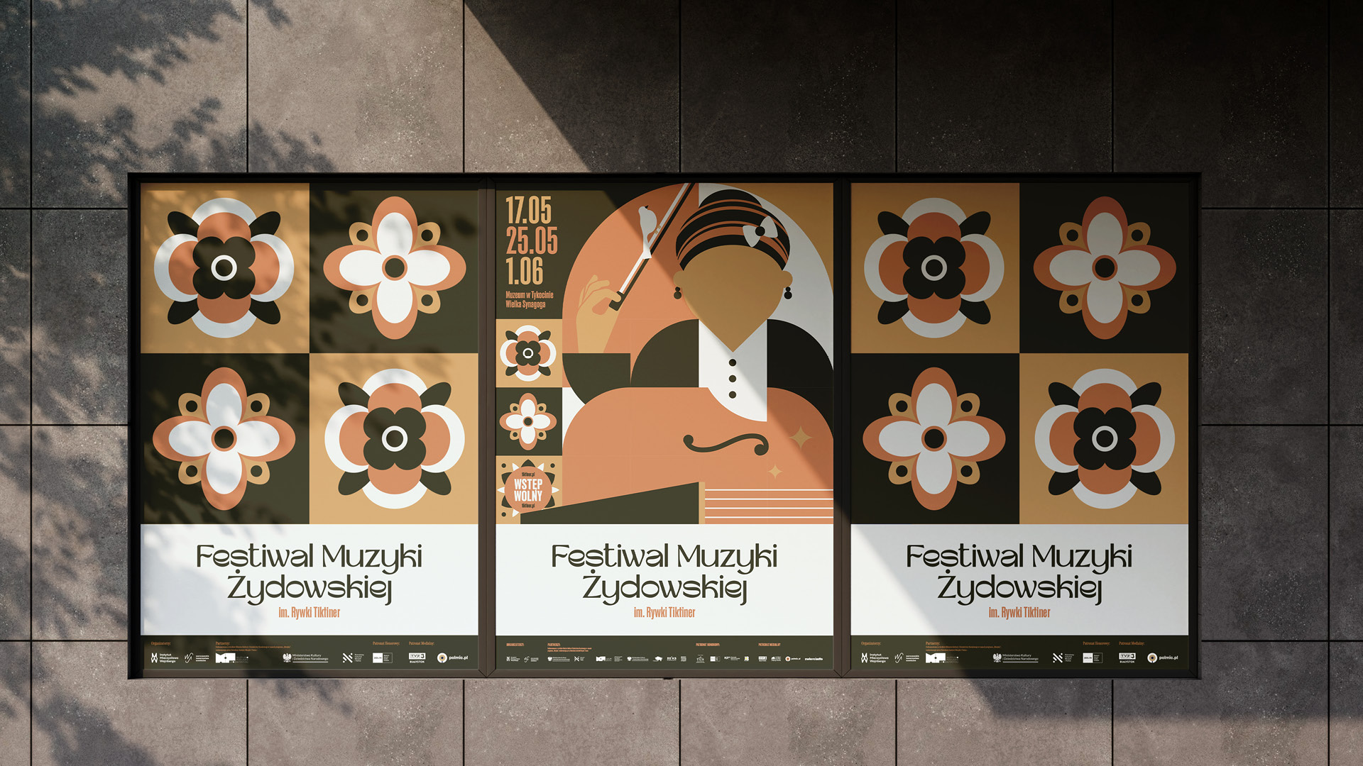
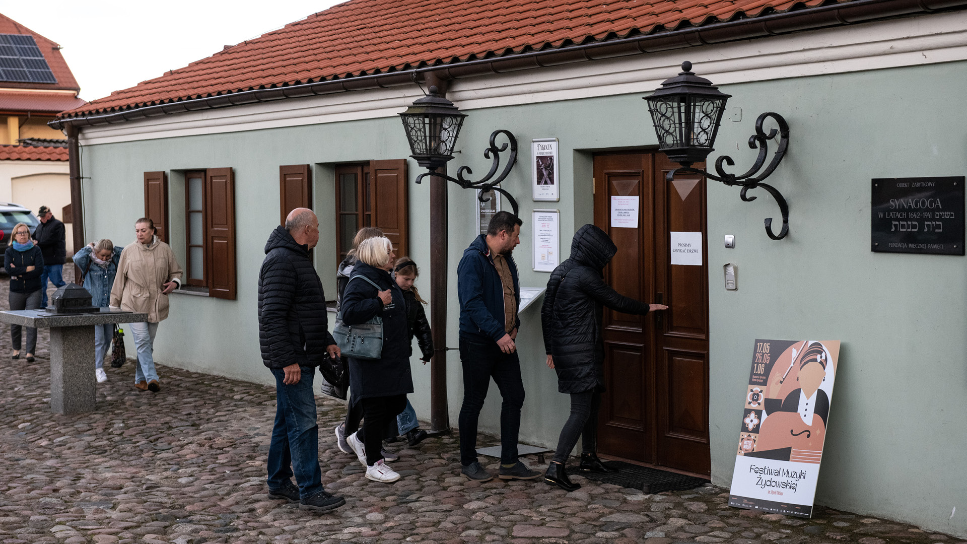
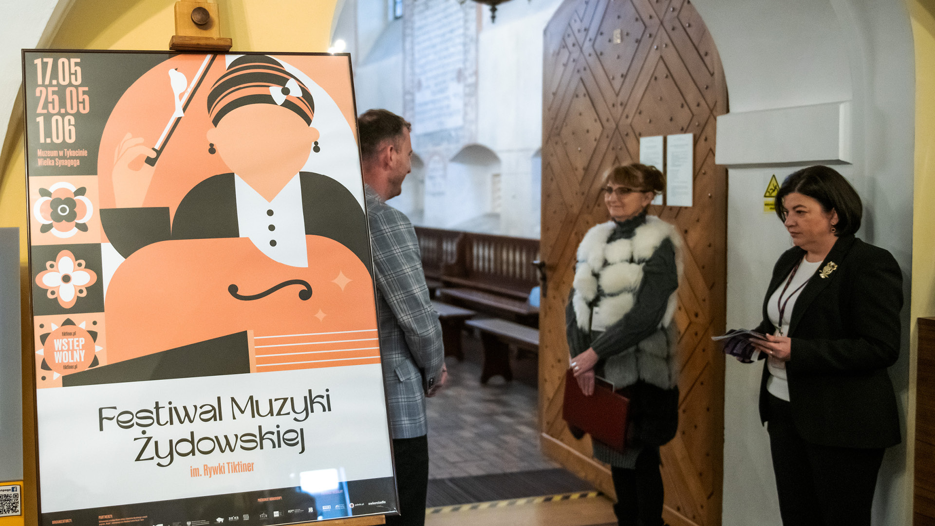
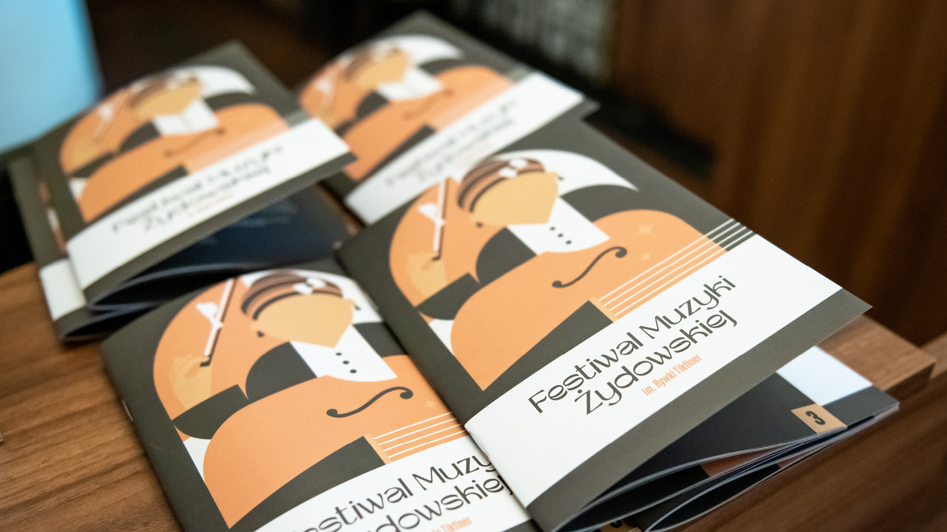
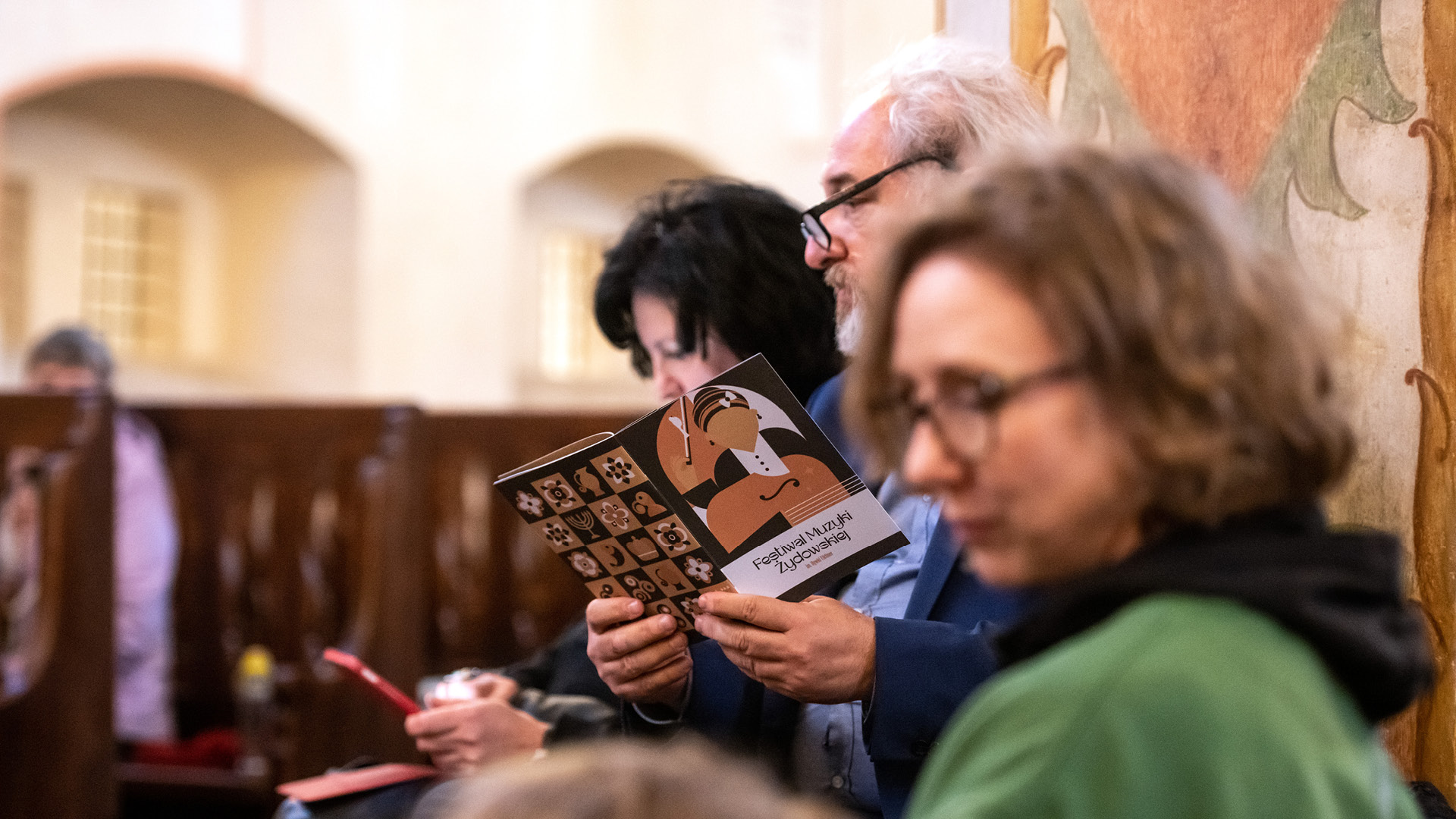
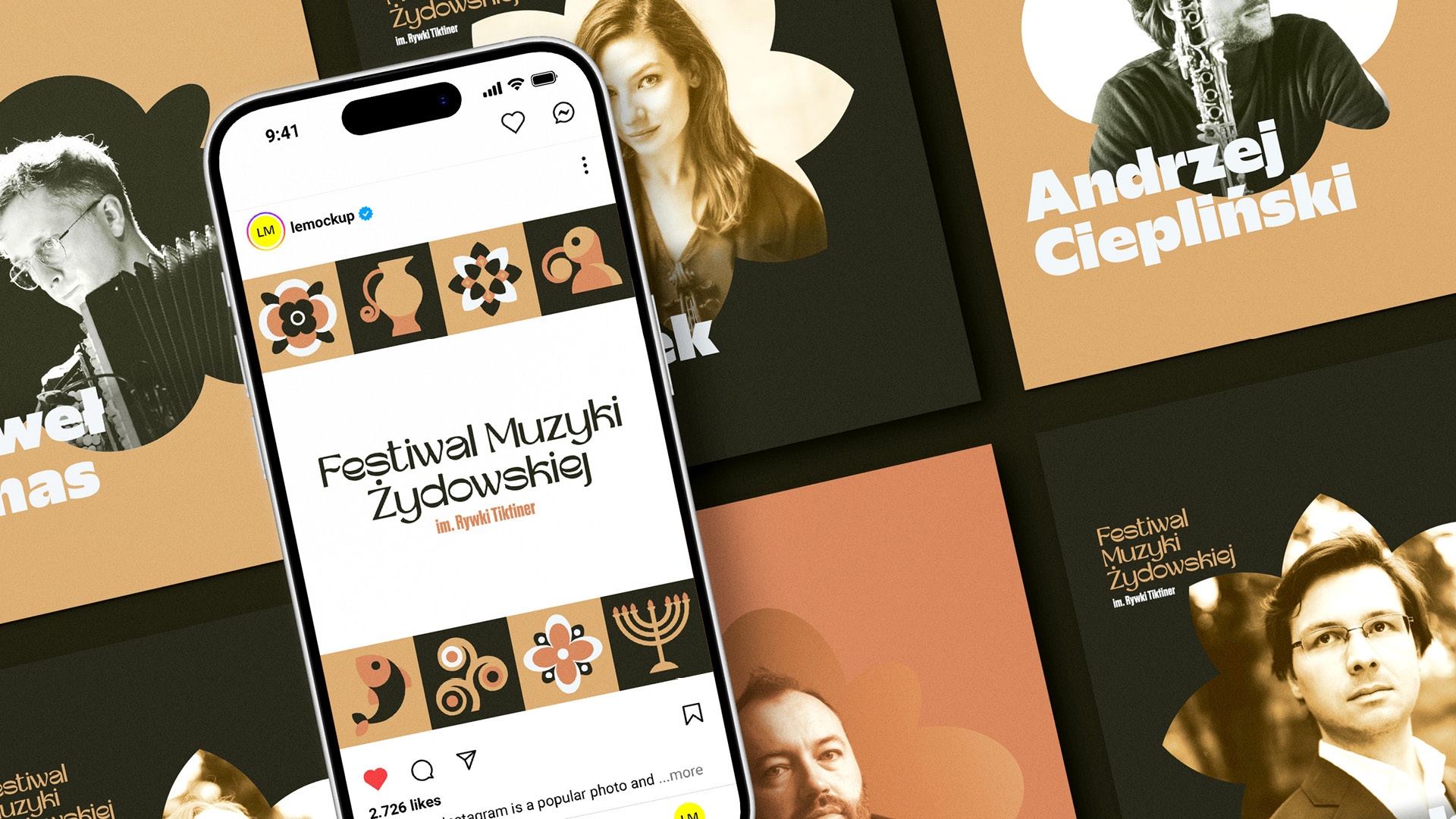
The visual identity for the 2025 edition is based on an illustrative language inspired by Jewish music, culture, and ornamentation. The central motif is the figure of Rywka, surrounded by a set of modular symbols and decorative elements. Floral forms, musical instruments, and references to Jewish culture create a flexible visual system that can be freely combined and scaled. This allows the identity to remain distinctive across both large formats, such as posters, and smaller printed or digital materials.
The colour palette is based on warm, slightly muted shades of orange and beige, contrasted with deep, dark brown. In materials promoting individual artists, the system combines photography with organic, floral frames and bold typography. Together, these elements create a warm, distinctive, and easily recognisable visual identity for the festival.
2026
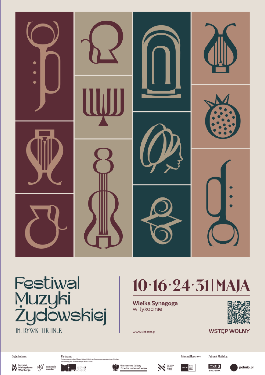
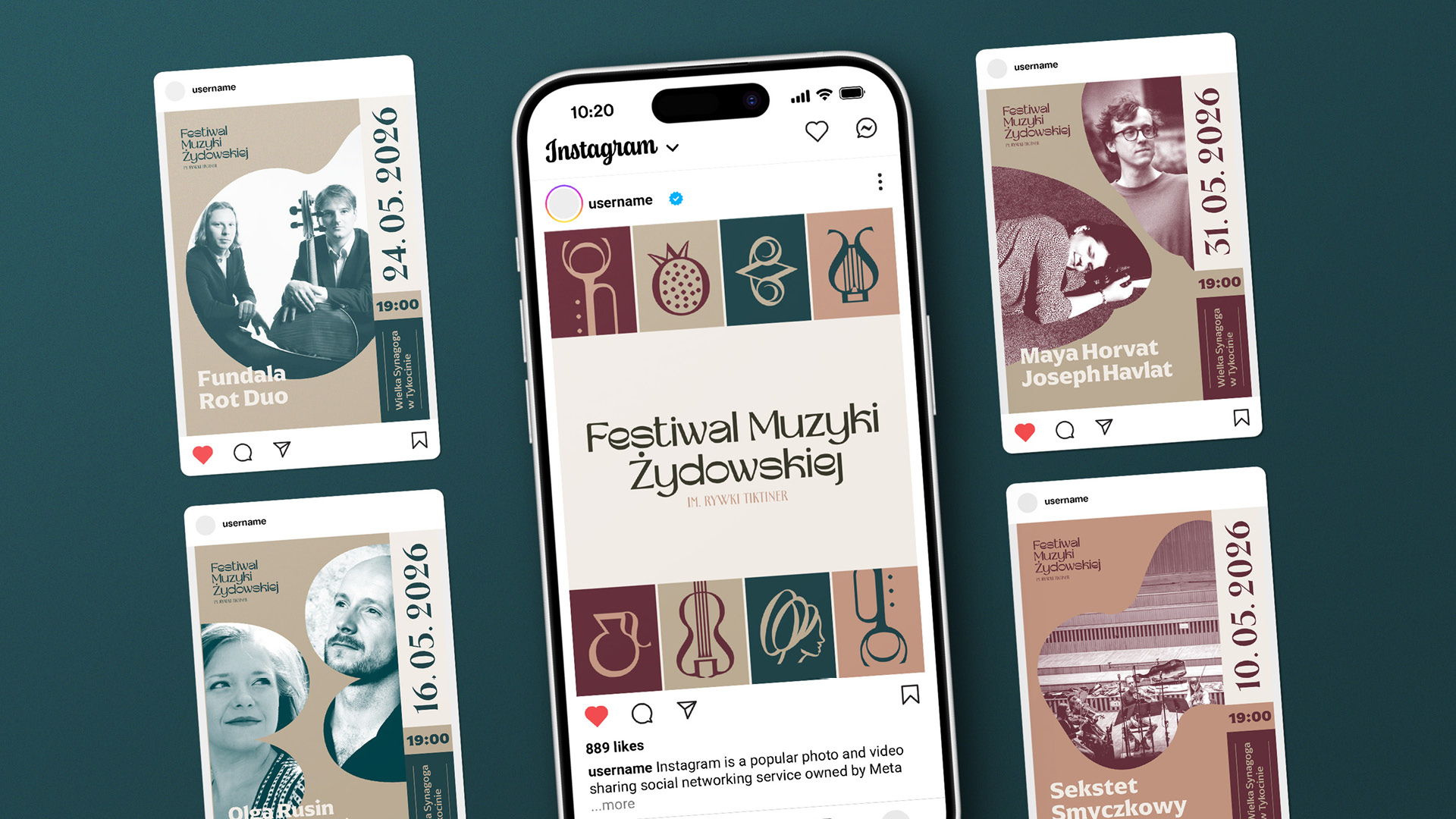
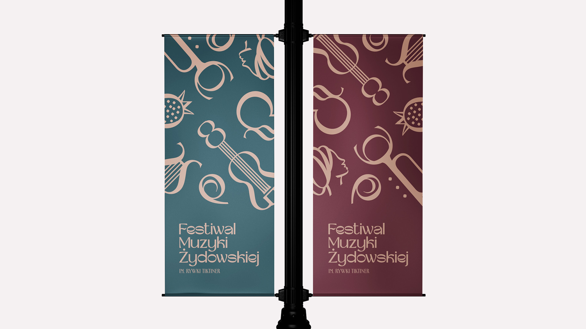
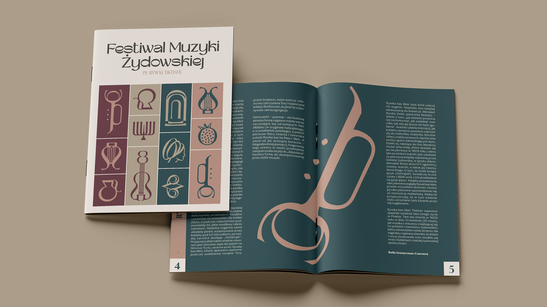
The strongest element of the visual identity for the 2026 edition is a set of linear illustrations inspired by musical instruments, music, architecture, and Jewish symbolism. The symbols work both individually and as modular compositions and patterns, allowing the identity to be flexibly adapted across different formats.
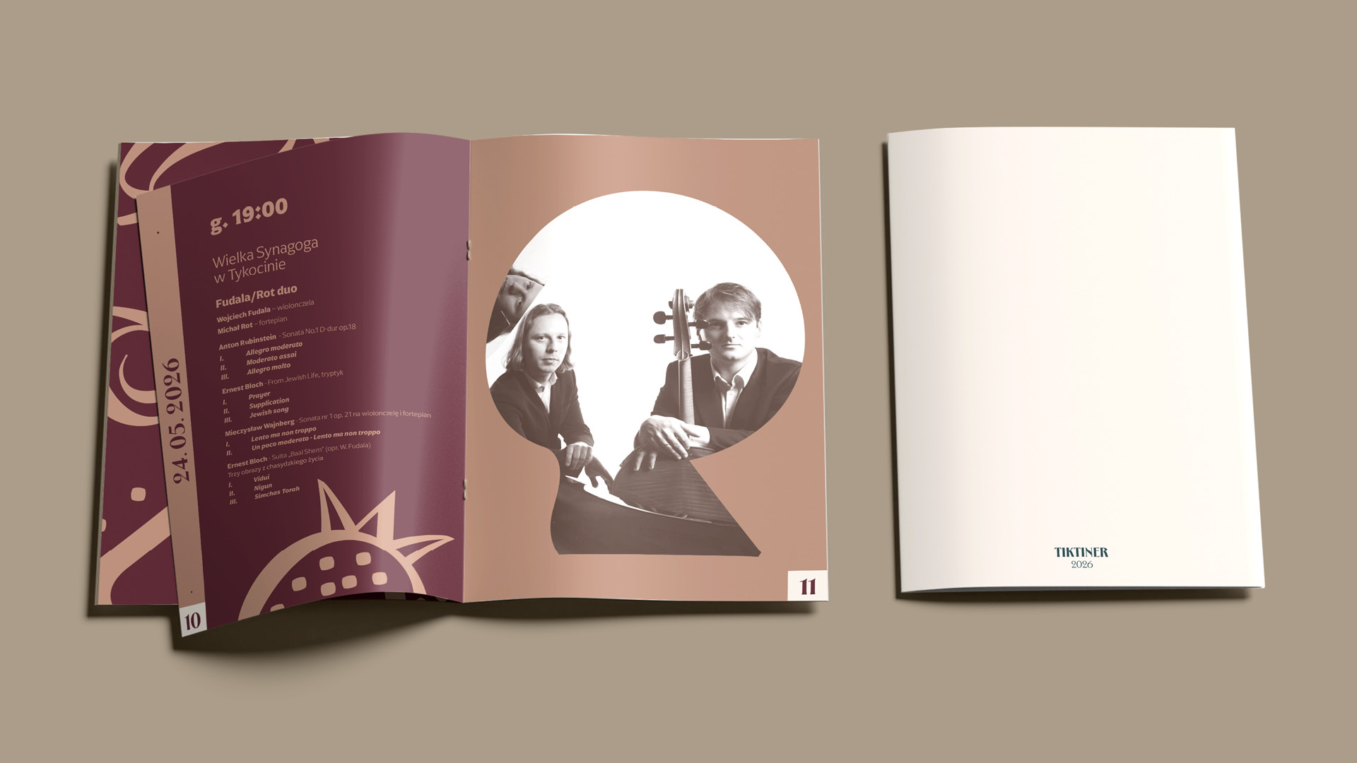
The distinctive colour palette — deep navy-teal, burgundy, muted pink, and warm beige — gives the project an elegant, cultural character while moving away from stereotypical visual references associated with Jewish culture. The system is complemented by the festival’s distinctive logotype, whose soft, rhythmic forms correspond with the illustrations and the musical character of the event.
The identity was designed to work across urban spaces, printed materials, and digital communication. Artist photography is combined with organic fields of colour and bold informational typography, maintaining a strong and recognisable visual language while highlighting the programme and performers.
The result is a flexible visual system based on rhythm, symbolism, and music, reflecting the festival’s historical and cultural context through a contemporary, light, and accessible visual language.
If you represent a cultural institution and are looking for a partner to create a visual identity for a festival or event — posters, catalogues, or social media materials — we invite you to get in touch.